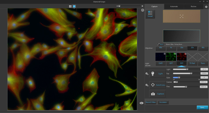
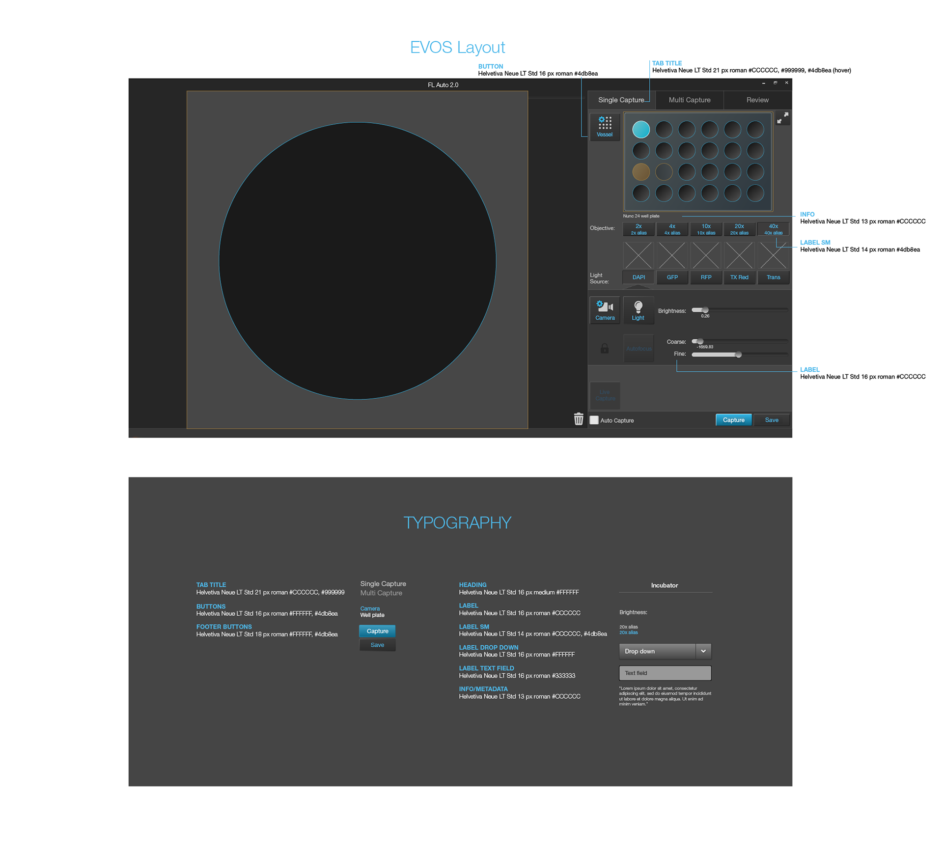
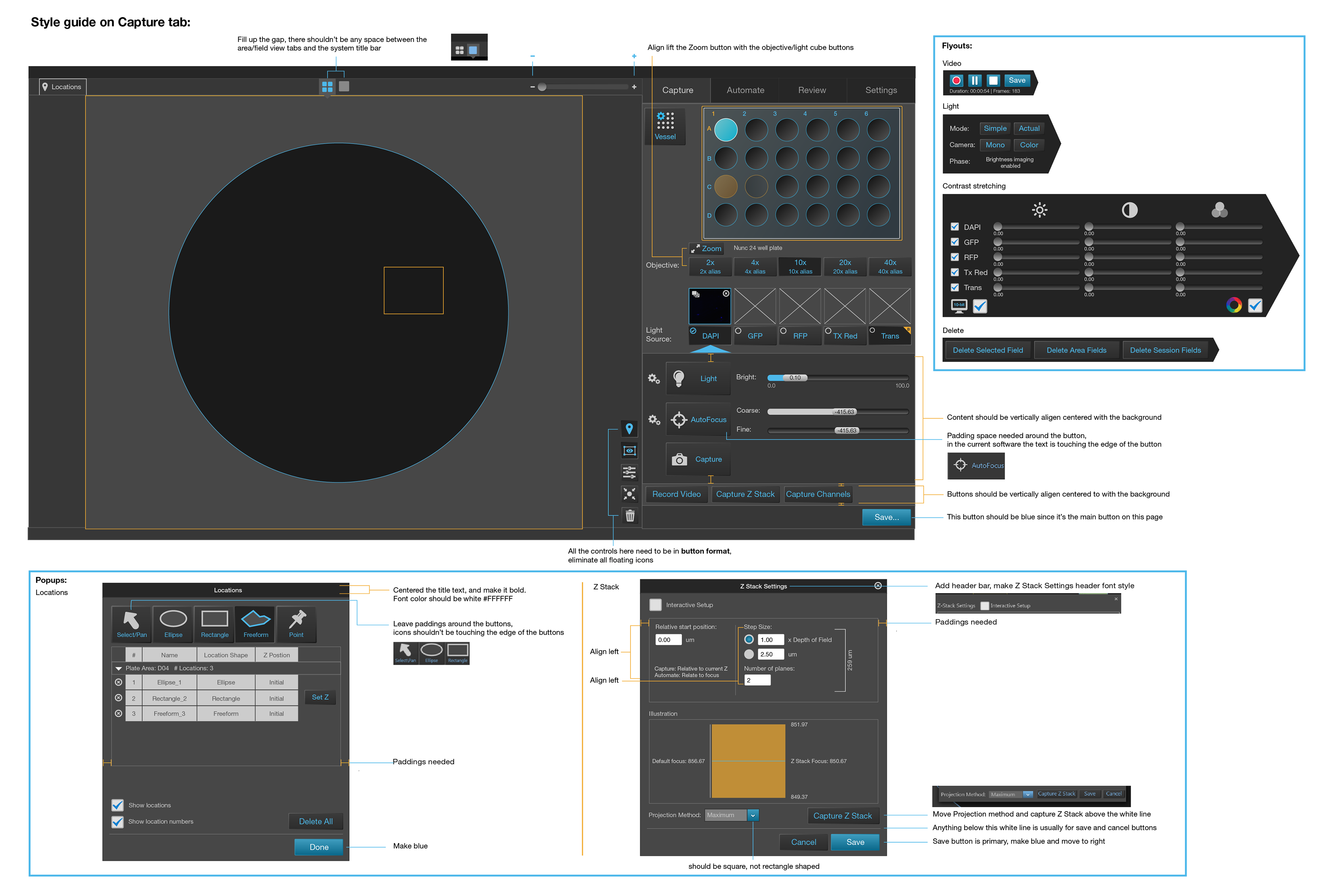
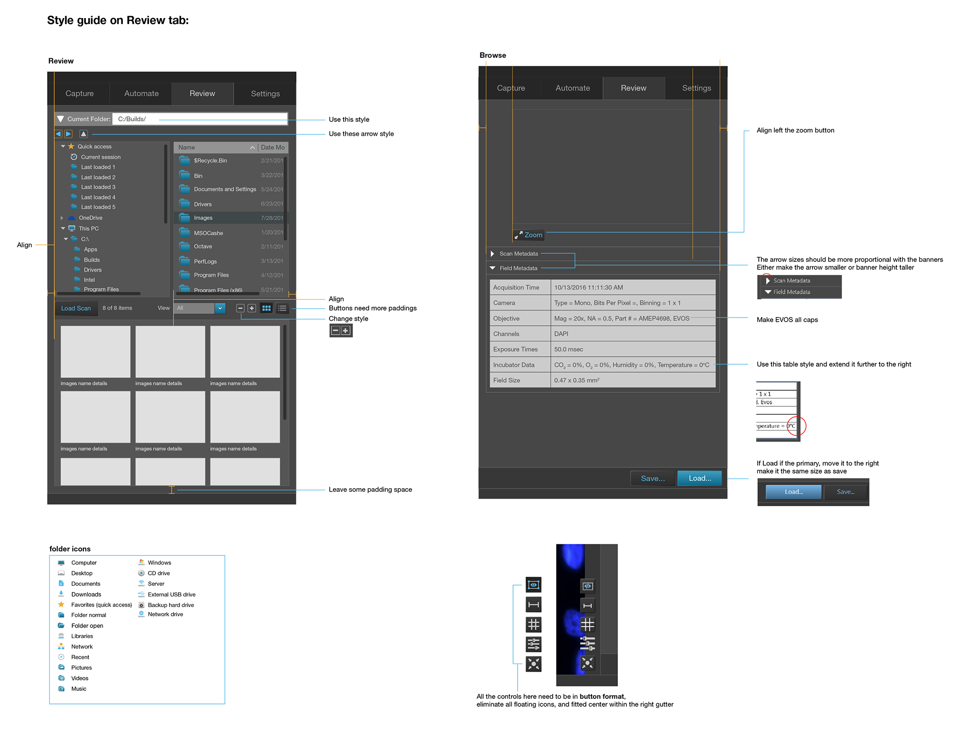
Redesigned the UI for the EVOS FL Auto 2 Imaging System, focusing on both functionality and user experience. I collaborated with developers to implement new features aimed at enhancing usability, while also contributing to the overall user flow and visual direction of the system.
Working closely with my team, I helped lead Alpha and Beta testing phases to gather comprehensive feedback from users. We used these insights to implement design solutions that were intuitive, user-friendly, and scientifically accurate.
Throughout the project, I produced interactive prototypes, high-fidelity mockups, style guides, typography systems, and pixel-perfect assets to support development and maintain visual consistency.
I served as the UI/UX designer on a cross-functional team, working alongside two other UX designers, two project managers, and eight software engineers.
Application launch icon
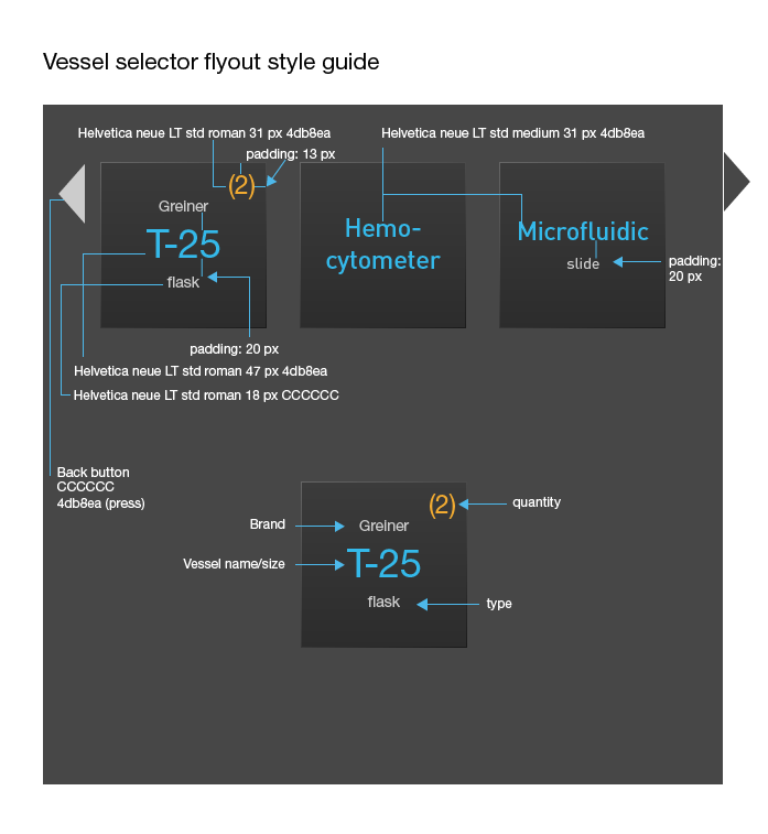
Vessel Holder Style Guides
Vessel holders are designed to provide a perfect fit for various research needs, accommodating everything from slides and flasks to dishes. I collaborated closely with the project manager to ensure we offered a wide range of vessel designs for customers to choose from.
I also worked with engineers to guarantee that every vessel graphic I designed was pixel-perfect and aligned precisely with the hardware specifications to avoid any display issues. The color palette I selected complemented the overall UI design while closely resembling the appearance of real-life vessel holders, creating a sense of familiarity and accuracy.
These designs received highly positive feedback from both Alpha and Beta testers, particularly for their visual accuracy and ease of use.
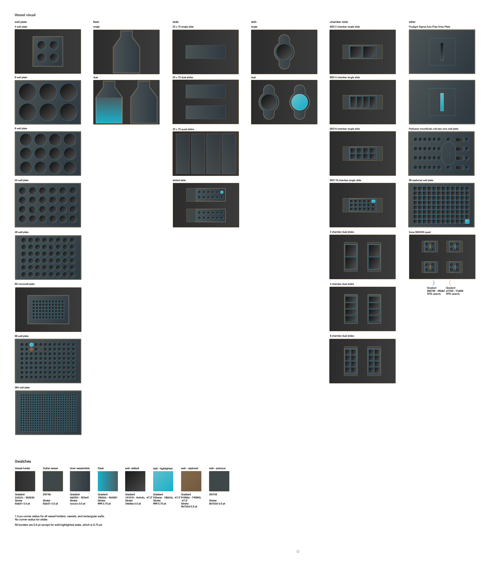
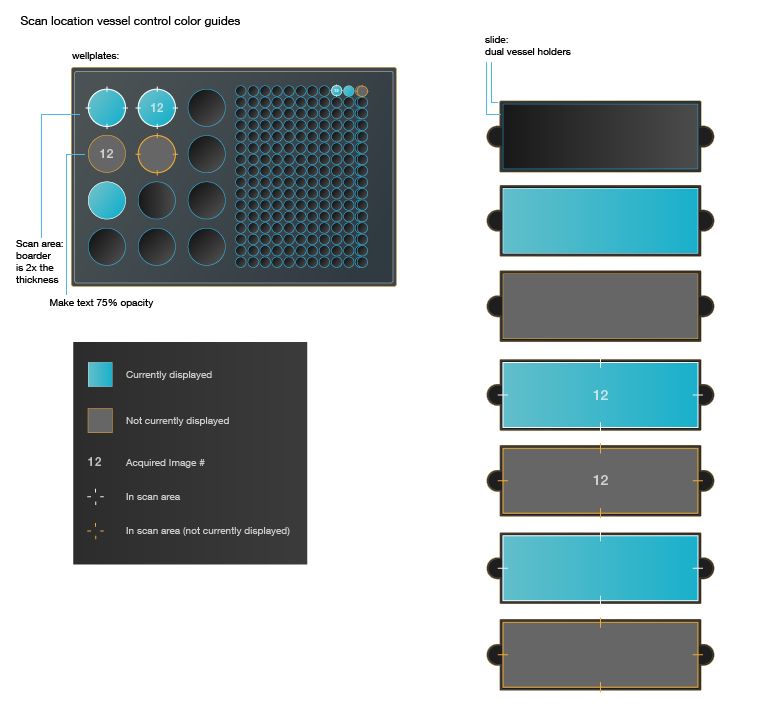
Vessel Control Color Guides
One of the key pieces of feedback from early Alpha testing was the lack of clarity in the vessel control states. Each vessel design required six distinct selection states, and making them visually clear and distinguishable from one another proved to be a significant challenge.
After exploring several mockups, I developed a solution that was well-received by both my team and the Alpha testers. The final design featured carefully chosen color variations that complemented the vessel visuals while enhancing clarity. The colors felt cohesive within the overall UI and effectively addressed the visibility issues identified during testing.