My portfolio wouldn’t be complete without sharing the story behind my own brand—Lux & Nox. Back in 2023, my best friend from high school reached out and asked if I’d be interested in starting a candle business with her. With her background in business and my experience as a designer, it felt like a match made in heaven.
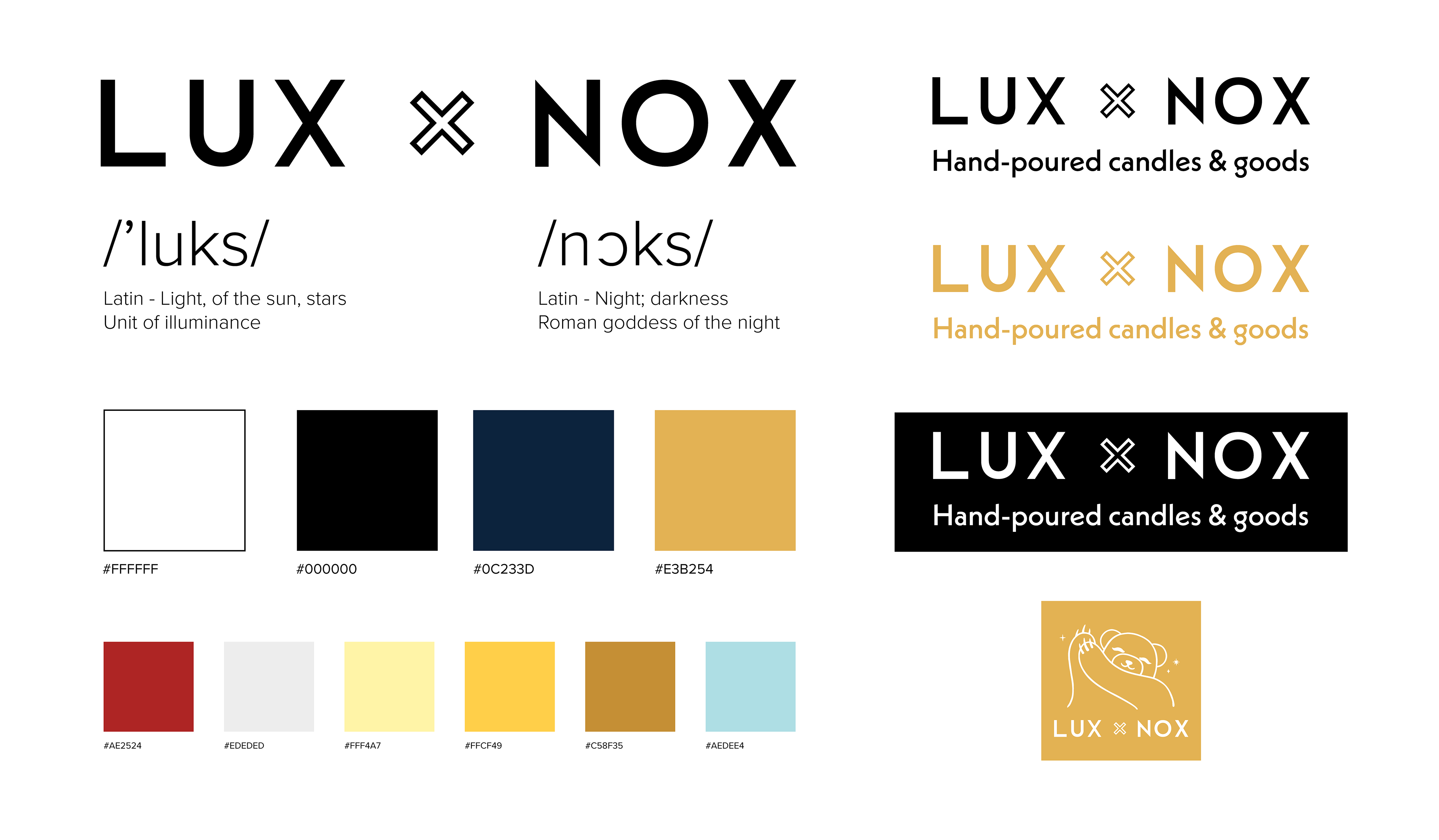
We started our two-woman business out of her kitchen, experimenting with different wax blends and fragrances until we finally landed on the perfect formula. When it came to naming the brand, we had tons of ideas, but ultimately we wanted something that reflected contrast—light and dark. That’s how we arrived at Lux & Nox. “Lux” means light or the sun, and it’s also a unit of illumination. “Nox” means night or darkness.
The name also perfectly represents us as individuals. She’s the bubbly one, always smiling, with a love for the color yellow. Meanwhile, my favorite color is black—open my wardrobe and you’ll find that 90% of it is varying shades of darkness. I also tend to lean into dry, deadpan humor, which balances her bright energy. And that’s how Lux & Nox came to life—a blend of opposites, working in harmony between two friends.

Our logo journey began once we finalized the name Lux & Nox. From there, I explored a wide range of logo variations—some in horizontal layouts, others stacked vertically—to see what best captured the spirit of our brand.
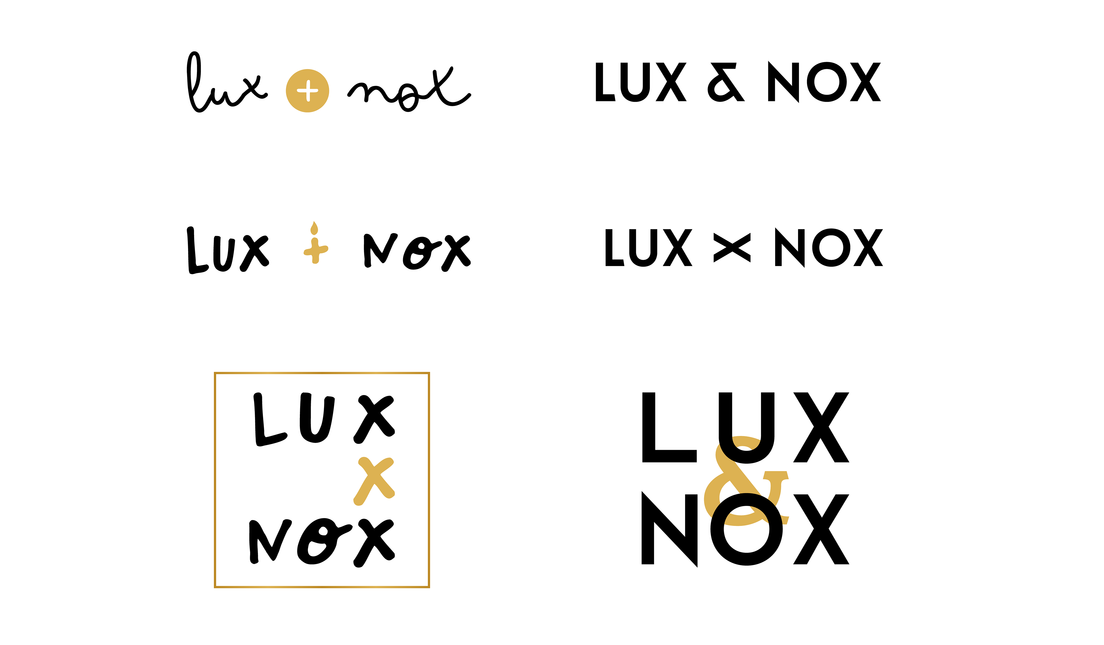
After several months of discussion, refinement, we finally arrived at the version we use today. The logo is crafted using a clean, modern sans-serif typeface for a minimalist yet refined look. One of its most distinctive features is the cut-out “x” in the center, which not only adds a unique visual element but also subtly symbolizes a wooden candle wick—wider and more organic, just like the ones we use in our hand-poured jar candles.
This small but intentional detail reflects my thoughtful approach to design and product-making, where even the logo ties back to the core of what we create.
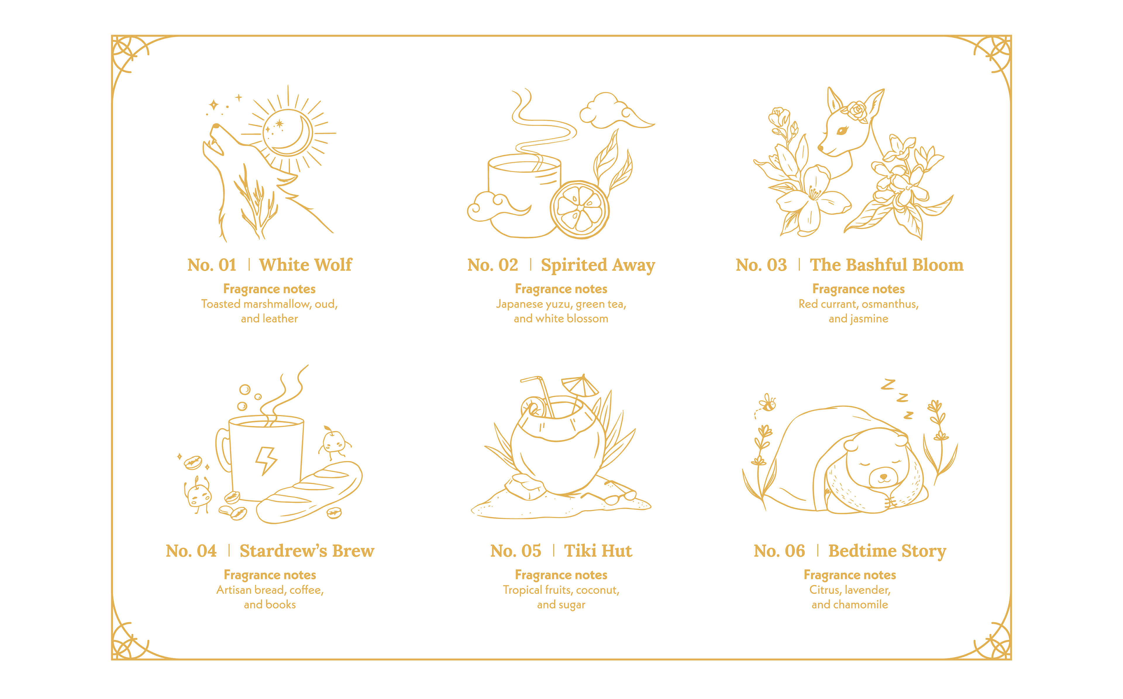
During the early development stage, we spent a lot of time discussing how we wanted our product to look—especially knowing how saturated the candle market became after COVID. We didn’t want to blend in; we wanted something whimsical, meaningful, and reflective of our personalities.
I proposed that we illustrate all of our designs by hand first (with procreate on iPad), then convert them into vector format for scalability and consistency across products. From the beginning, I knew this approach would take more time compared to using stock imagery or relying solely on typography—which is common among many other candle brands.
However, choosing this hand-drawn, line-art illustration style gave our brand a distinct voice. It added a personal, handcrafted touch that aligns with our values and vision—playful, intentional, and artfully made. Each label becomes more than just packaging; it becomes part of the story we’re telling.
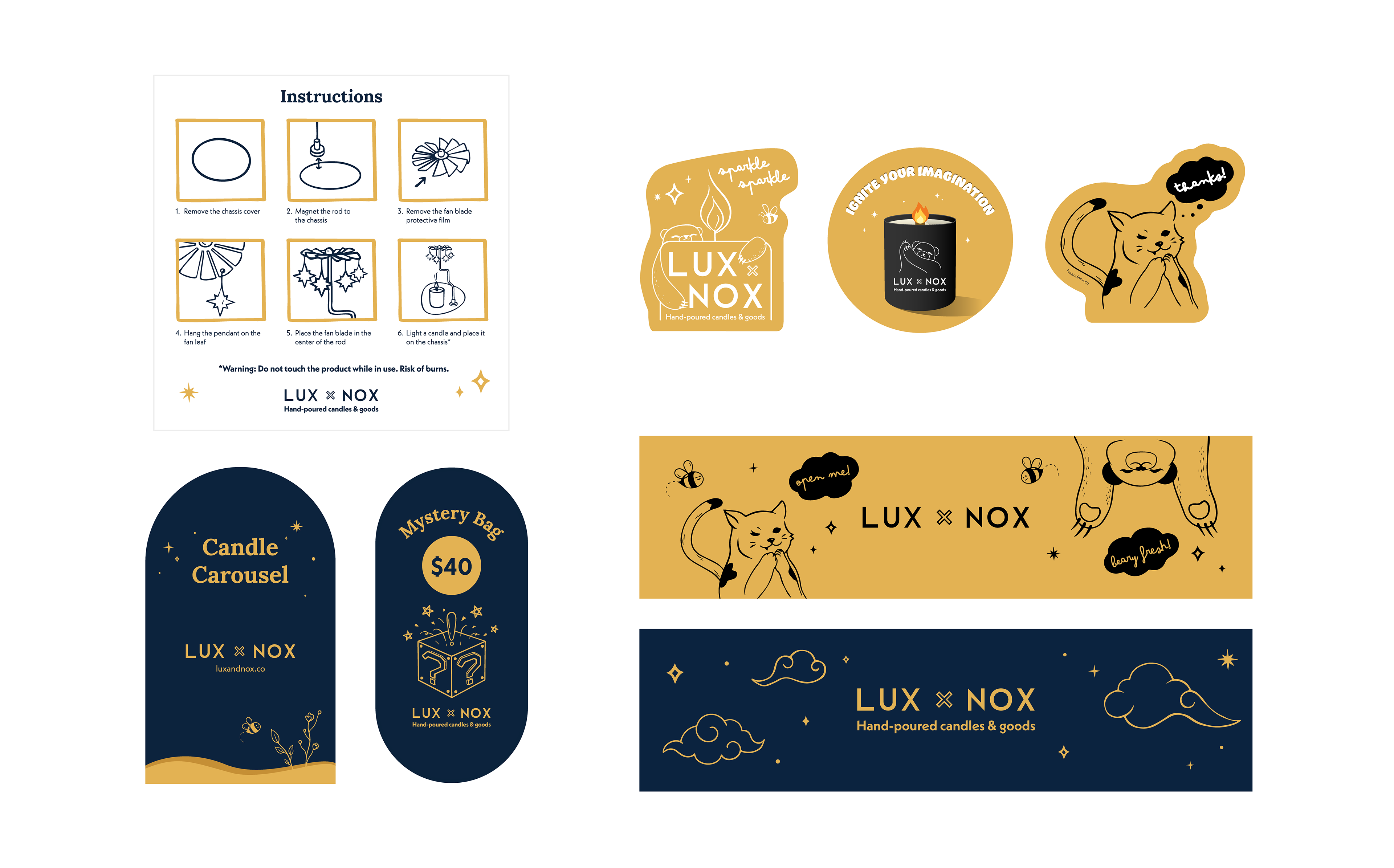
The illustrative direction we took for our packaging turned out to be a hit—it really resonated with our customers and helped us stand out. Feeling confident in the visual identity we had created, I decided to expand this style across all of our branded materials.
This included everything from packaging tape, signage, instruction cards, and gift bags to other touchpoints that contribute to the unboxing experience. Each piece was thoughtfully designed to maintain consistency and reinforce our brand personality—whimsical, handcrafted, and memorable.
By carrying our hand-drawn illustration style beyond just the product labels, we were able to build a cohesive and recognizable brand presence that left a lasting impression on both new and returning customers.
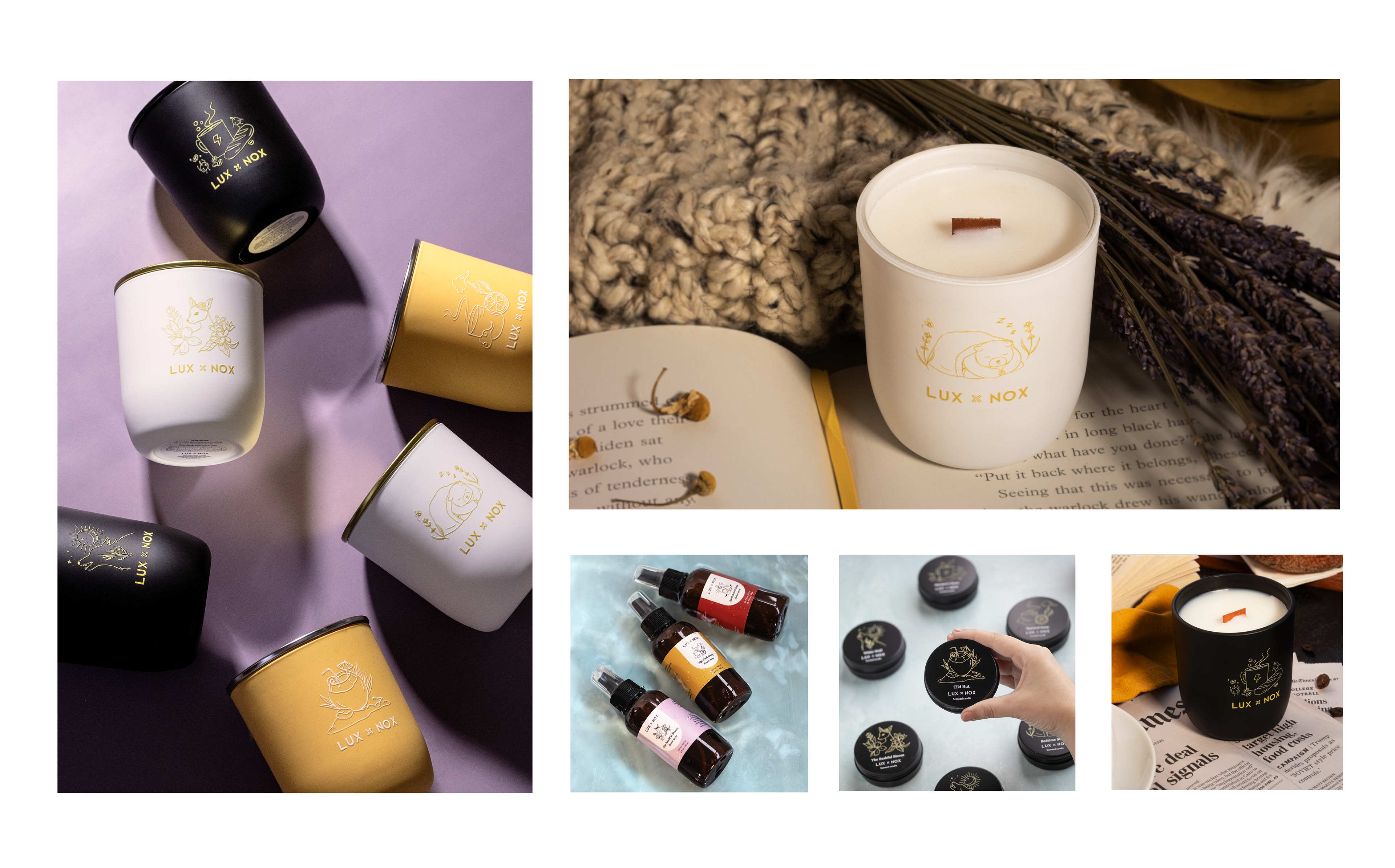
As a two-person operation, we wear many hats—including product photography. In order to build a strong online presence and meet the visual standards required for craft fair submissions (especially the more competitive, large-scale ones), we knew professional-quality images were a must.
Fortunately, I have a background in photography and expertise in retouching, which allowed us to take this aspect of the business into our own hands. From styled lifestyle shots to clean product-focused imagery, we've worked hard to capture the essence of Lux & Nox—fun, inviting, and thoughtfully crafted.
Below are just a few examples of the images we’ve taken to showcase our products. We’re always looking for ways to improve and expand our brand storytelling through visuals. In fact, we have an exciting photoshoot planned for this summer, and I can’t wait to unveil what we’ve been working on.